So it seems I have been posting quite a bit of NARS lately.. but you know what? There’s more!!!
Behold the magnificent NARS Kauai Duo. A metallic antique gold and a medium shimmery purple.
From the two quads that released this Spring, this one was my top pick, as I can honestly say I have no eyeshadows in my collection which can be considered as exact dupes. Although China Seas is beautiful in it’s own right, I never see myself reaching for a blue of that tone for everyday makeup. However, since purple is my favourite for accenting my deep brown eyes, getting this was a no brainer.
So pigmentation wise both shades pack some serious colour, and the gold more so. It’s pigmented to the point where it felt like cream! And never before have I ever encountered such an amazing texture, not even the Hourglass eyeshadow duos (which I would describe as silky rather than creamy when compared to this) 🙂
While photographing the swatches I only had to do one firm pass to get this to show up in full opacity, but for courtesy’s sake I decided to do two.
On to the purple… This too was highly pigmented and I find that it’s a great liner shade if you don’t see yourself using the duo for a complete eye look on a day to day basis. Personally i’d get more use out of them as singles, the gold for a nice wash of colour for a night out and the purple as an accent colour to jazz up a neutral beige eye look for the day time.
So without wasting more time here are the swatches…. please note that these were taken in natural light.
If you asked me, is it worth rushing out and buying? I’d say yes, only if you see yourself using these type of shades. But as far as quality goes, this one can’t be beat and is a must have if you are a makeup lover like myself 🙂
Other info-
These eyeshadows lasted well over 8 hours on me with no creasing and I found them very blendable and easy to work with.
Available at Sephora (U.S) which is where I purchased mine.
And here it is! The limited edition NARSissist eyeshadow palette. 15 gorgeous eyeshadows housed in one palette.
Pictured below is a guide to all the swatches and reviews, named for your convenience 😉
L & R (Left and Right) are colours that appear in existing duo eyeshadows. The others are all existing singles except Bad Behaviour which was an LE.
( All about Eve(L), Madrague (R), Fez, Bali, Coconut grove)
*P.S- Click on the images to view full size 🙂
Row 1
All about Eve (L) – A shimmery warm beige with a slight pink tinge. This had medium colour pay off, and went on somewhat sheer.
Madrague (R) – A light brown with a slightly warm undertone, this matched my medium skin and disappears once blended in. I feel on fairer skin tones this would show up very well.
Fez – A high shimmer coppery bronze. This had excellent colour payoff. The best performer in this palette!
Bali– A neutral dark brown. Although this was not dry to the touch and was finely milled, it applied quite patchy with less than impressive pigmentation. This was the dud in the palette, which was a shame as it would have been a great colour for crease work in a neutral matte eye look.
Coconut grove – A deep, dark, warm matte brown. It was finely milled and pigmented, and the colour pay off was average, although I should note it was a bit disappointing compared to the Coconut grove single eyeshadow, which had incredible colour payoff and is one of my all time favourite NARS colours.
(Madrague (L), Nepal, Ashes to Ashes, Brousse (R), Mekong)
Row 2
Madrague (L) – A matte cream shade with a light yellow undertone. This was very soft to the touch and finely milled. The colour pay off was very good and would make a lovely highlighter for the brow bone or a good base shade.
Nepal– A warm shimmery rose. This had good colour payoff, soft and blendable. One of my favourites!
Ashes to ashes – A neutral taupe shade with a shimmer finish. This went on a bit sheer due to its harder, firm texture, but I found that the colour was easily buildable.
Brousse (R) – A deep dusty aubergine shade which was gorgeous. I did find some difficulty picking up the colour as it was a dryer, stiffer texture. Although, this too was buildable to full opacity.
Mekong – A deep dark matte brown with bronze shimmer. This was well pigmented with very good colour payoff but was slightly on the dryer side. A gorgeous shade nonetheless.
(Bellisima (L), Lhasa, Bad Behaviour, Dogon (R), Pandora (R))
Row 3
Bellisima (L) – A shimmery yellow ivory shade with gold flecks. I found this a little powdery and applied sheer.
Lhasa – A dusty shimmery lavender shade. One of my favourites in this palette as I owned nothing like it! This too was on the harder side, and went on sheer but was easily buildable to medium opacity. And looked gorgeous once applied!
Bad Behaviour – A LE colour released with the Guy Bourdin collection. This is a warm pewter shade. The colour payoff was good. And was pretty much opaque once applied.
Dogon (R) – A deep Navy with very fine shimmers, although upon application it looked almost matte. This felt soft to the touch but the colour payoff was not too great.
Pandora (R) – A deep matte black. This had decent colour payoff, although blends into a very sheer shade which required a lot of building to get full coverage.
Final thoughts
I found the colours in this palette very workable, I personally see myself reaching for this regularly if not every day.
All but three had good and buildable coverage, namely Bali, Dogon and Pandora.
And my favourites were Fez, Nepal, Lhasa, Bad behavior and Mekong.
Overall around 9 out of the 15 were very good shades (blending easily and buildable to a higher opacity with no powderiness). It’s value for money, considering In Singapore a duo retails somewhere around $45 I believe.
For those who prefer very highly pigmented eye shadow with intense colour pay off, this palette might be a bit disappointing. However for a majority of makeup users this would make a perfect travel companion or a great addition to your everyday makeup bag as it’s a nice compact size housing a total of 15 eye shadows!
Also if you are already a collector of NARS eyeshadows and own quite a number of these shades, obviously there’s no point in purchase since none of the colours are new. However if they are your favourites, this would be a great way to own the same colours (for travel purposes) as a portable version at a very economical price.
In conclusion, I see this palette selling out fast, as all NARS palettes. So if you are interested, act fast 🙂
Special thanks to Julyen at the NARS counter at Tangs for providing me with valuable info while putting together this post for you and also a thank you to NARS for generously sending me a palette for review.
P.S- To see this palette in action, drop by my IG page, there’s a dramatic eye look that I post yesterday after my NARS makeover 🙂
I know my blog is slowly turning into a blog dedicated exclusively to Dior makeup, but once you find something you love, you start to obsess over it right? RIGHT? 😛 (Don’t stop till you get enough they say!)
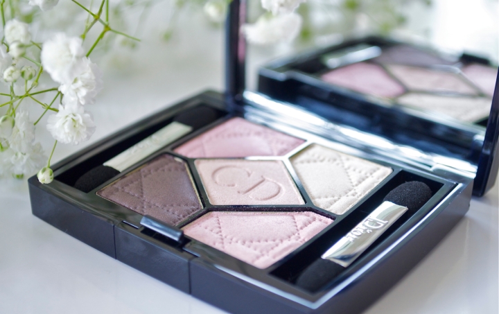
Anyway, so this time around it’s something from an older collection, Rose Porcelaine 834, which I purchased at Neiman Marcus recently.
At first glance I loved that there’s a healthy combo of cool and neutral pinks in this palette. Perfect for Spring!
However swatches proved otherwise!
The quint consisted of,
A cool medium toned almost cotton candy pink – swatches very sparkly and the colour gets lost in the midst of all the shimmer
A cool soft yellow/cream shade – excellent for highlighting the inner corner of the eyes, it went on smooth.
A light beige/ pink shade – The pink in it disappeared on my tanned skin, looked more of a frosty white, but the texture was silky smooth
A warm light baby pink shade – This was not as frosty as the others and would look lovely on fair skin. A great everyday shade for a light wash of colour over the entire lid.
A medium mauve brown – not as silky when I swatched it, but I liked that the shimmer content in this was to a minimum!
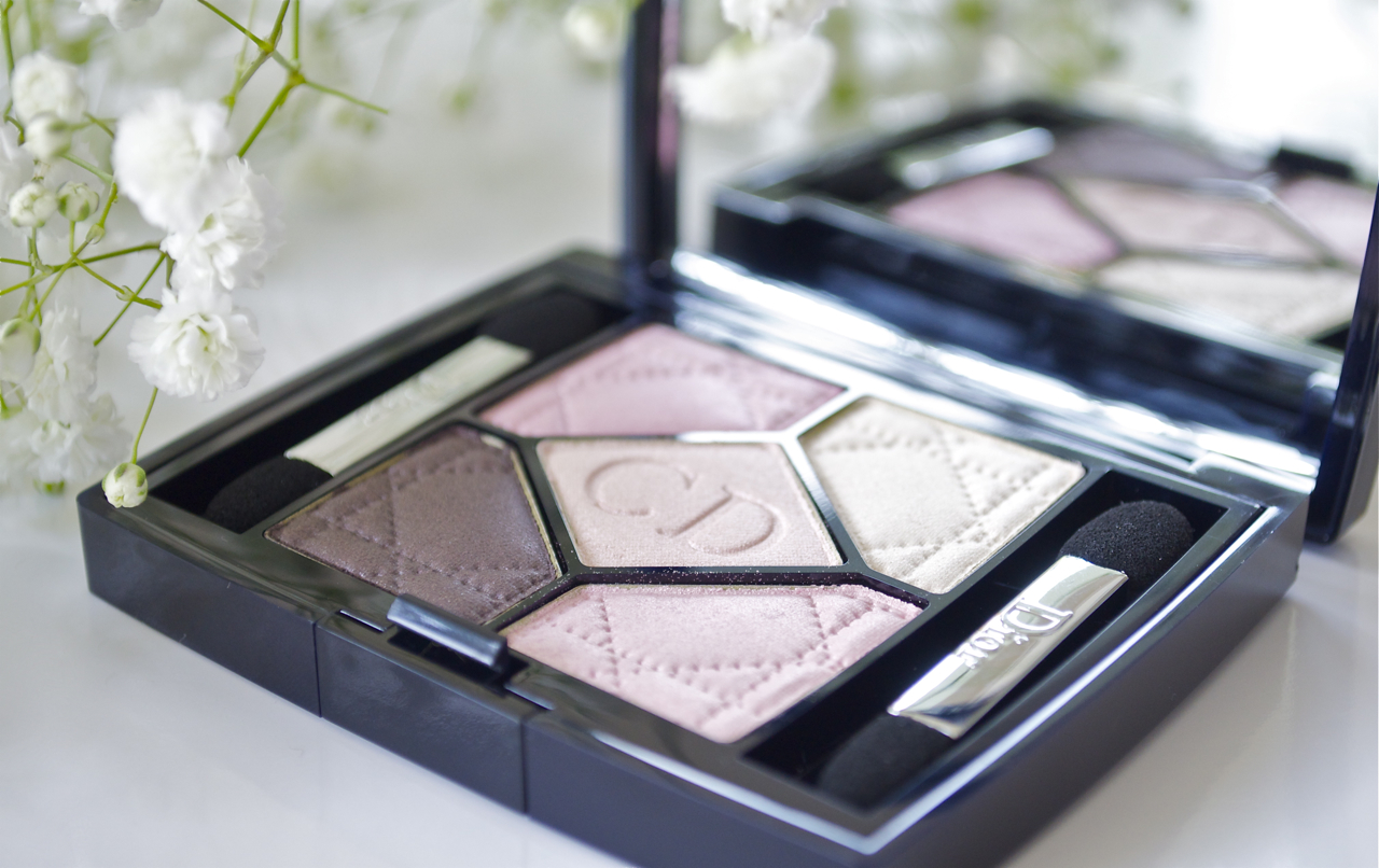
Overall I feel this palette would be perfect for those who prefer their eye shadow sheer and not too pronounced. The intense shimmer content in some of the shades prevents the shadow from taking a true to pan colour on the lids, however for anyone below a NC 25, this should look ok for a fresh Spring makeup look. The quality was good, and I usually don’t experience much fall out with Dior shadows, most fall out only occur during application and nothing during the day.
I found the best combination for medium skin is the top right shadow combined with the two below. However, I’d like to end on the note that this is a quint best suited for the lightest of the light skin tones, and personally I wouldn’t recommend it as there were too many light shades and they all looked pretty similar, not value for money in my book
I purchased mine from Neiman Marcus
You could also purchase this online from Sephora
Thank you for stopping by, hope you have a wonderful weekend!
As promised, much awaited swatches and a little eye candy to get you through this boooring post 😉
Starting off with a little overview of what Dior had on offer this Spring.
As you may have already seen (unless you were living under a rock the last month or so, or have been on a social media ban) Dior Spring 2014 was all about creating very fresh wide eyed girlie looks with soft pastels and a random burst of bright pinks.
Although I know pastels for Spring isn’t really the most novel idea to come around, I just want to state that Dior did it oh so well! From the pretty pastel blues, to the lilacs to the baby pinks, I could truly find nothing to complain or whine about, except for the fact that almost all the eye quints and palettes were geared towards the fairest of the fair.
However here are my picks from this collection, ideal for medium skin tones AND you fair ladies out there!
* Lipstick in this pic appeared brighter and more deeper in hue than it truly is, the others are true to colour though 🙂
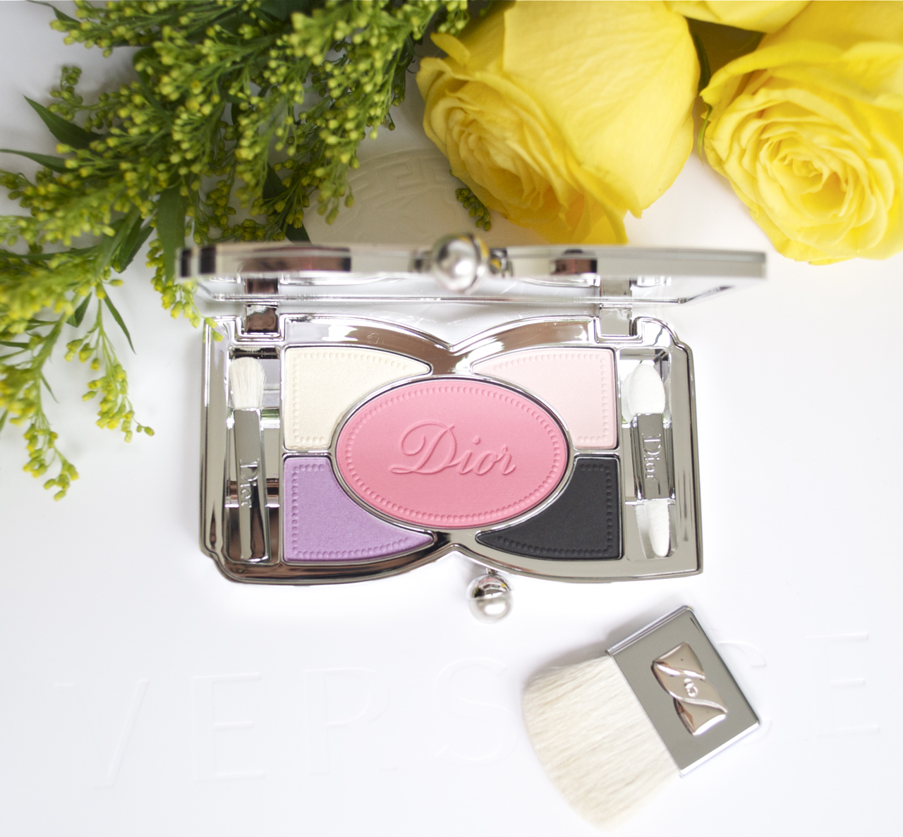
My pick from the palettes was 002 Coquette.
Dior 002 Coquette palette
After swatching all the other palettes that were released with this collection, I found that Favourite and Coquette to be the best pigmentation wise and could be built up to true to pan swatches.
As all Dior or other high end eye palettes, this too came in a velvet sleeve and the palette was pretty heavy and felt lovely to hold (unlike light plasticy packaging most drugstore makeup is housed in).
The palette also included a large mirror, two small eyeshadow applicators as well as a cute little bow handled brush that’s meant for applying the blush (although I highly doubt it would ever get used as it’s pretty scratchy). Bottom line, the packaging was exquisite… True Dior style!
Onto the important info 😉
002 Coquette- 10.8g Net.wt 0.38 oz
consisted of-
A soft buttery yellow – This had a high shimmer finish and almost ivory white once applied; a great highlighting shade. The texture was silky smooth and blends very easily.
An iridescent lilac – Had good colour pay off and is buildable to a true to pan shade. I experienced zero fall out, and after hours n hours of wear, no creasing! Something I have consistently noticed with most Dior eyeshadows.
A light baby pink – Another incredibly light shade with a satin finish. I used this as a transition colour to blend out the lilac and make it look more diffused by softening the edges. *Must note that this was of a slightly more powdery texture and a fair amount of powder got kicked up while I was applying it on the lid. Although when I smoothed it and blended it, the satin finish comes out further giving it a beautiful sheen.
A sooty matte black – Perfect to use as a soft liner with this purple eye look. Sadly the pigmentation was poor and applied patchy due to it’s dryer texture. The worst performer in this palette.
The Blush, a warm bright corally pink, perfectly compliments the eyeshadows, and although it looked intense in the pan, it blends out quite sheer without any powderyness. The final result was a very natural looking healthy, rosy flush.
*This was of a matte finish
Blush swatches, heavy and sheered out.
From the selection of Rouge Dior lipsticks on offer, I picked up 761 Courtisane ( 3.5g Net.wt 0.12 oz.)
Courtisane is a cool toned pink, and looks slightly coral in the tube. But once applied it looks pretty much pink. You only need about two passes to achieve full opacity and the lipstick wears well and keeps lips moisturized. I tested out Courtisane topped with Minauderie and it wore around three hours and through a meal of Ramen after which it faded evenly and I was left with a pretty pink stain.
P.S- If you haven’t tried the newly reformulated lipsticks, you don’t know what you are missing! GO.SWATCH.NOW! 😉
Lastly the two glosses I picked up were #382 Minauderie a cool lilac shade and #442 Petillante, a warm light peachy pink, both sheer, but what stood out was the incredible multidimensional shimmer.. it was so fine, and sparkled like diamonds! These topped over cream lipsticks or satin lipsticks, instantly plump up the lips and give the illusion of a fuller luscious pout!
* as seen in swatches Minauderie contained lilac and pink shimmer and Petillante contained pink and soft gold shimmer
Left to right, Rouge Dior 761 Courtisane, Dior Addict gloss 382 Minauderie, Dior addict gloss 442 Petillante
P.S- Dior lippies and glosses don’t have any detectable scent. The SA informed me that they are usually unscented, which is something I love! Personally I hate heavily scented lippies.. specially the YSL ones have an incredibly strong fragrance to them.
In conclusion I felt the collection was a winner, from the gorgeous polishes to the lipsticks, very well worth your hard earned money. And let’s hope to see another fab collection by Dior this Summer!
* for nail lacquer swatches and review, please refer my previous post!
I received my palette as a birthday gift from my friend Val a couple of months back, and of course she fished around to see what I had my eye on from the Tilbury collection, and I am happy to say I was ‘consulted’ before she purchased this for me and therefore it was exactly what I wanted! 😛
I like many, was so intrigued to try Tilbury products as I heard she was one of the core consultants who put together those fabulous quads by Tom Ford. Needless to say expectations were sky high when these hit the market and everyone wanted a piece of Tilbury to add to their makeup collections!
My review was based on it’s individual performance as well as a comparison to Tom Ford palettes.. hope you enjoy.
Charlotte Tilbury Glamour Muse
The packaging is a sleek mahogany, and has a strong retro look with it’s rose gold accents, I love how it doesn’t retain fingerprints and is pretty easy to keep clean. It’s not as weighty and large as the Tom Ford palettes, although I love this size as this is ‘just right’ and perfect for traveling with.
Charlotte Tilbury Glamour muse eyeshadow shades
The eyeshadow palette consists of four beautiful shades (no matte shades, just varying degrees of satin and shimmer),
a. A pale pearlescent warm pink which felt silky and very smooth to the touch, however it didn’t swatch as pigmented as I expected. And looks more ivory than pink on me as I am of a medium complexion. (In the swatches you can clearly see that it goes on sheerer compared to the other two shades)
b. A Rosy/taupey shade, which was the best performing from this palette, it had a significantly higher shimmer content and was buttery smooth. I LOVE this shade! (Though it looks pretty basic in the pan, it swatches very differently)
c. A warm grey satin shade, a little less buttery and creamy compared to the other two mentioned, and was just alright.
d. A glitter amethyst purply shade, which i’d like to call ‘the dud’ . This eyeshadow performed so poorly I was surprised and let down, It actually sucked on a monumental level! And while trying this out, I had to pack on the shadow so much, my eyelid hurt from all the tapping! Ultimately I think the best way to apply this is with your fingers cos a brush does a lousy job.
The glitter somehow gets lost in application and looks nothing like the pan, and there was a notable amount of fallout which led to a slightly lower score as far as the overall palette went. Another thing to mention is that, this was the colour that took this palette from boring to fresh, so when that shade doesn’t perform I feel this palette looses it’s appeal.
Here are the swatches for your viewing pleasure! All taken outdoors in natural light.
* Note that the purple had to be built up significantly to get it to look presentable in this pic
Overall I’d give this palette an 7/10 simply because the colours worked well together and blended easily as they were so silky smooth compared to the dryer texture of the Tom Ford satin shades (I swatched a few in comparison just for kicks n giggles).
What I disliked was as I mentioned before, the less than impressive glitter shade being SUCH a dud, and compared to the glitter shadows that Tom Ford makes, this was lacking pigmentation as well as glitter, the whole purpose of this shadow might I add.
But purple shade aside, it’s a great palette to own if you just want it for the neutrals and you can do a great day look with this quad. I see myself reaching for this just for the rosy/taupe shade.
The eyeshadows wore pretty well on me and didn’t crease (I used it over my By Terry Hyaluronic primer btw). And lasted well over 8 hours, which is great.
Other info-
Net wt. 5.2g
Available at Selfridges.
Hope you enjoyed this post and please suggest in the comments below what products or brands you’d like featured, i’d try my best to review them for you if I have them in my stash.


You must be logged in to post a comment.